Overview

Overview

Overview

The Project

I led the redesign of the tooling in 3 phases with a focus on improving user performance and content exposure. Three months after the redesign, we witnessed improved task efficiency by 40+%, almost 25% reduction in errors and 33+% increase in end user scale.

What I did

  • User research

  • Competitor Analysis

  • Prototyping

  • Usability testing

  • Dev handoff

The Team

  • Product owner

  • Product designer

  • Technical lead

  • 7 Developers

  • UI Designer

Background

Background

Background

What is an API?

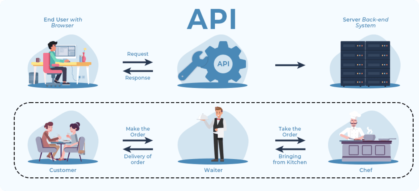
You can think of API as waiter in the restaurant who takes your order request to the chef and takes the food item back to you. It is like a mediator allowing applications to communicate with each other.

What is our proudct?

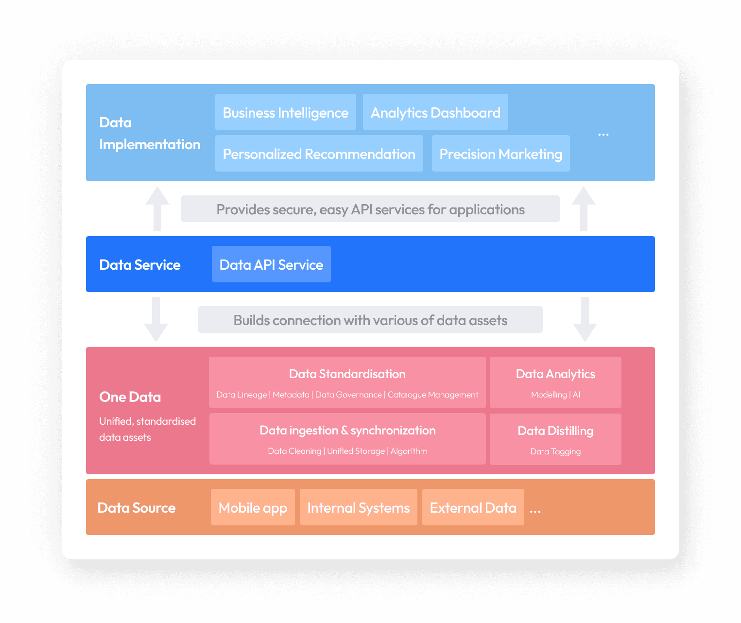
The 'engine' of big data implementation

Much like engines that convert resources into mechanical energy, Data API Management Platform transforms data assets into standardised components (APIs), making data fast to consume and easy to manage.

How does it work?

Create, consume, manage and socialise data APIs

In a nutshell, it’s a platform allowing users to quickly create consume manage and socialize data apis. There are 3 user roles. Provider developers create and publish data apis by providing some technical information. Once APIs are published, consumer developers will be able to request access to the apis, and integrate them in applications and web services. These apps are eventually consumed by the end users.

Research

Research

Research

Initial user research to fill potential knowledge gap

Prior to the project, I conducted user interview aiming to help fill in any knowledge gap that the product team might have regarding technical user requirements. This is important as internal tooling are closely tied to technical/business needs of users, the methods of communication and hierarchical structure of the organization. Interview is usually the best way to understand how users work in their specific roles, and how they approach to resources & codependencies.

Prior to the project, I conducted user interview aiming to help fill in any knowledge gap that the product team might have regarding technical user requirements. This is important as internal tooling are closely tied to technical/business needs of users, the methods of communication and hierarchical structure of the organization. Interview is usually the best way to understand how users work in their specific roles, and how they approach to resources & codependencies.

Prior to the project, I conducted user interview aiming to help fill in any knowledge gap that the product team might have regarding technical user requirements. This is important as internal tooling are closely tied to technical/business needs of users, the methods of communication and hierarchical structure of the organization. Interview is usually the best way to understand how users work in their specific roles, and how they approach to resources & codependencies.

Customer support analysis & moderate interviews for deeper, granular understanding

We firstly worked with the support team and concluded prominent areas users struggled with, followed by moderate interviews with our dedicated users to better understand their experiences. I limited the number of objectives and asked only applicable questions to specific users due to the tight timeline.

Mind that user interviews is arguably the most effective method of user research for internal tooling design due to the depth and breadth of conversations, the level of receptiveness of face-to-face communication, as well as the potentially increased responsiveness compared to surveys.

Problem Definition

Problem Definition

Problem Definition

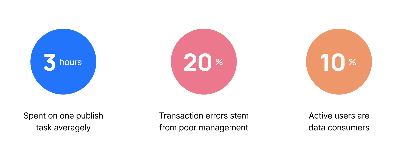
After synthesizing our research findings, we identified 3 major user problems for this project. As a key player in the process of big data implementation, our product is meant to improve productivity and break down information barrier between departments, but users struggle to complete basic tasks, resulting in low efficiency and engagement. Here are some of the most concerning statistics:

Design plan in 3 phases with estimated success metrics

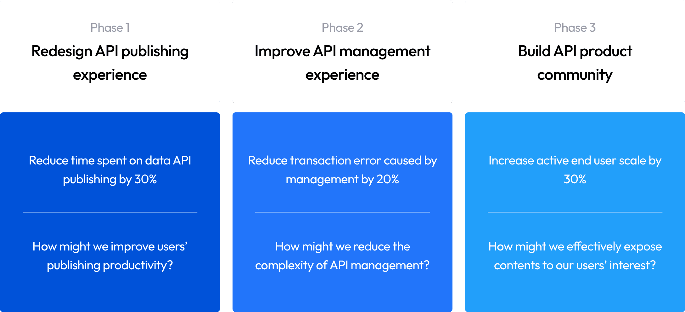
Together with product owner, we agreed on a plan to revamp our product in three phrases based on the level of priority. The success metrics were determined prior to the design based on conservative estimation and controlled experiment.

For example, to set up the goal on publishing efficiency, we estimated the time users spent on customer support during publishing as a reference, and tested the task completion time by users who are highly familiar with our product as a baseline. From there we estimated that the actual amount of time spent on the task would be at least 60% less than now provided that users understand how the pages work. Therefore we set up a conservative goal of 30% for our project.

Phase 1

Improve API publishing efficiency

Phase 1

Improve API publishing efficiency

Phase 1

Improve API publishing efficiency

Pain points

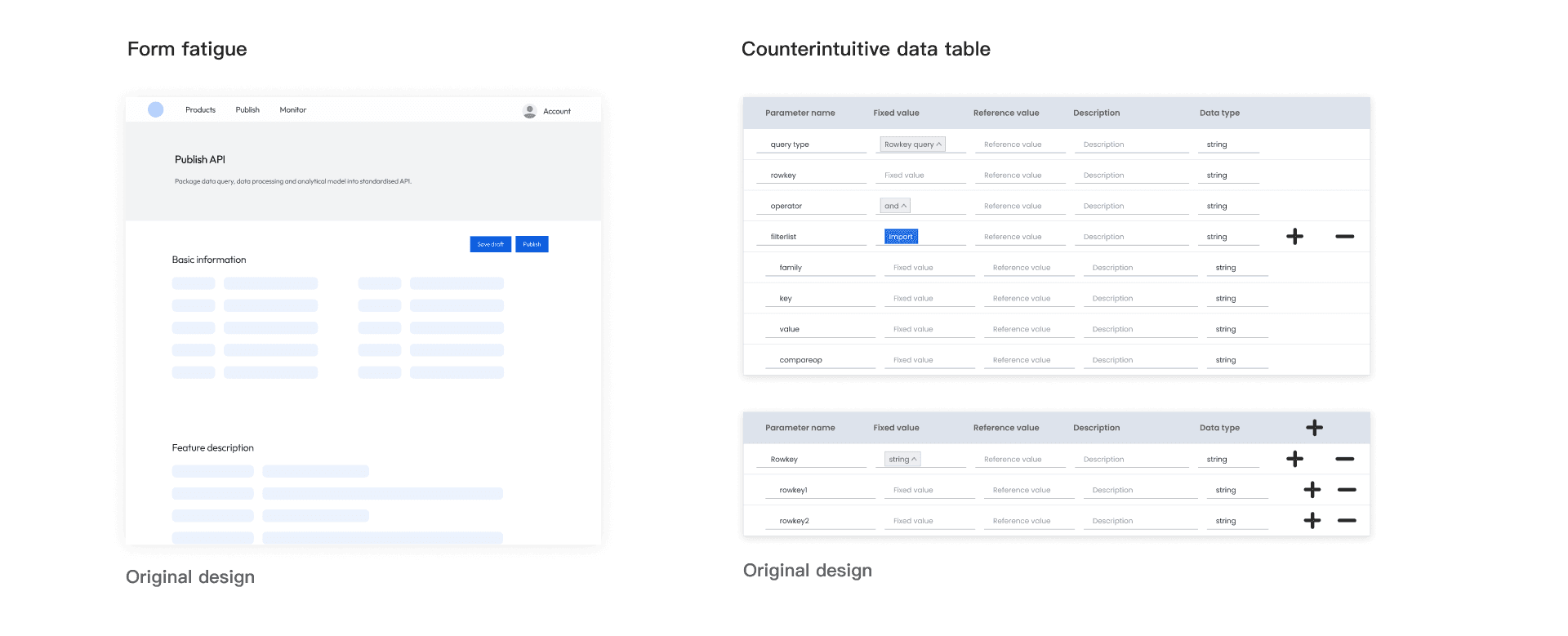
When I looked at the publish page, I noticed how cluttered the information was, and the data tables on the page appeared very confusing. My assumptions were validated by our users, as a matter of fact, the two major frustrations they encountered was form fatigue and counterintuitive data table.

When I looked at the publish page, I noticed how cluttered the information was, and the data tables on the page appeared very confusing. My assumptions were validated by our users, as a matter of fact, the two major frustrations they encountered was form fatigue and counterintuitive data table.

When I looked at the publish page, I noticed how cluttered the information was, and the data tables on the page appeared very confusing. My assumptions were validated by our users, as a matter of fact, the two major frustrations they encountered was form fatigue and counterintuitive data table.

Addressing form fatigue

Structural, accurate and guiding

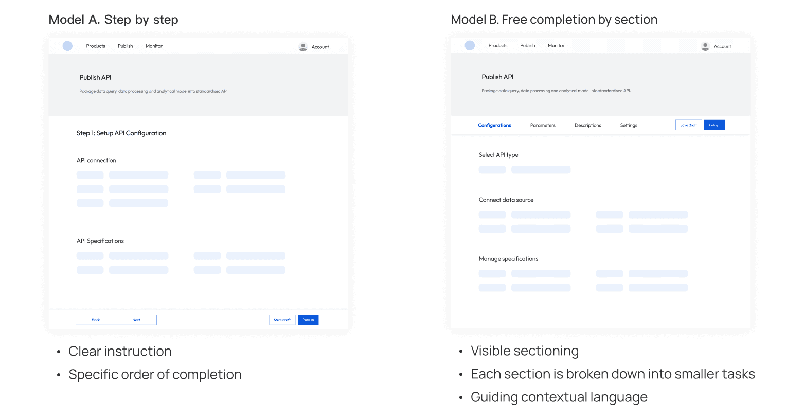
Recognizing that obscure and dense information impeded publish experience, I mapped out two design solutions incorporating step guidance and sectioning. The options are tested related to sectional information density, completion process and context-setting language.

The test unveiled user behaviour that the team did not know - because the process of publishing isn't necessarily linear, our users tend to jump between sections depending on the information they have at hand.

Therefore they preferred model B due to its visible structure and the freedom to navigate. Overall, model B suits user behaviour better, the improved language accuracy facilitated better understanding, while lower sectional information density created an impression that the page can be completed faster.

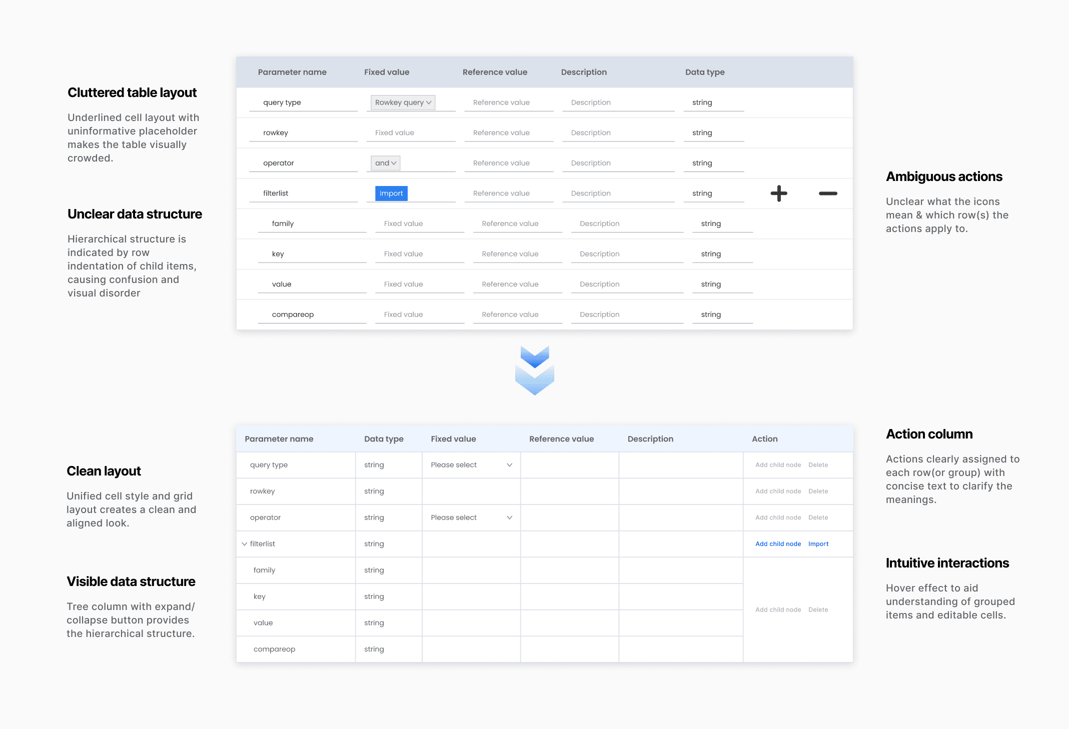
Addressing data table

Interactive tree table with add-row feature

Understanding the frustration caused by disjointed data structure and ambiguous actions applicable, I implemented a cohesive table layout with interaction that prioritised clarity and ease of use.

Achievement

40%+

Average reduction in time spent on single publish task

Average reduction in time spent on single publish task

“I publish APIs for hbase data query frequently, the platform has done an exceptional job in API template design, I was able to grasp how it works quickly and the experience has been amazing.”

— Provider developer testimonial

Phase 2

Improve Transaction Management

Phase 2

Improve Transaction Management

Phase 2

Improve Transaction Management

Pain points

Observing a considerable number of customer support instances concerning API transaction handling, I encapsulated the following primary issues that led to transaction errors:

Observing a considerable number of customer support instances concerning API transaction handling, I encapsulated the following primary issues that led to transaction errors:

Observing a considerable number of customer support instances concerning API transaction handling, I encapsulated the following primary issues that led to transaction errors:

  • Feature onboarding: Many new users requested assistance for onboarding instructions and expressed that learning curve surpassed their anticipations.

  • Transaction progress tracking: The customer support team had dealt with a significant amount of transaction error cases by the absence of status indication.

Addressing feature onboarding

Consolidated navigation & feature description

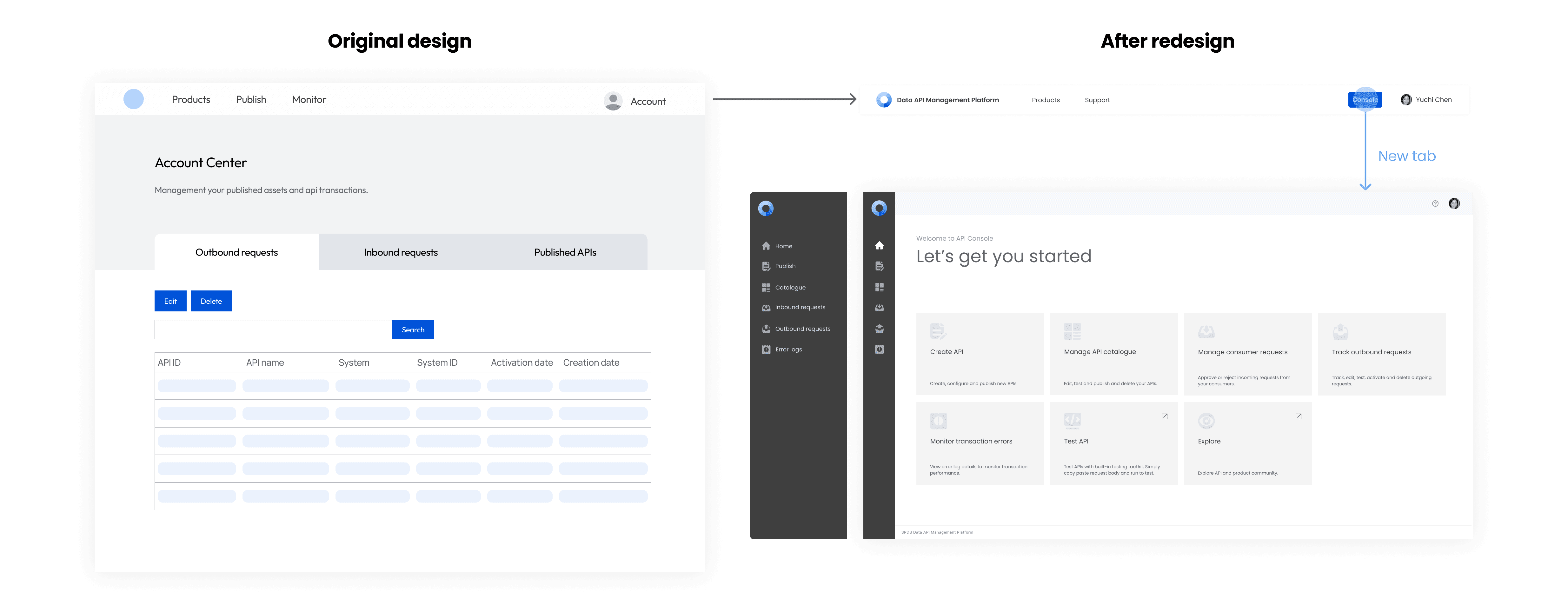
Understanding the frustration caused by inconsistent information architecture and a lack of onboarding guidance, I implemented the following changes:

  • Systematic navigation structure consolidating all developer features in the developer console, facilitating a more coherent experience.

  • Home page with succinct feature description clarifying the purpose of each feature to help users onboard.

Addressing transaction tracking

Clear, accurate table with mutually exclusive statuses

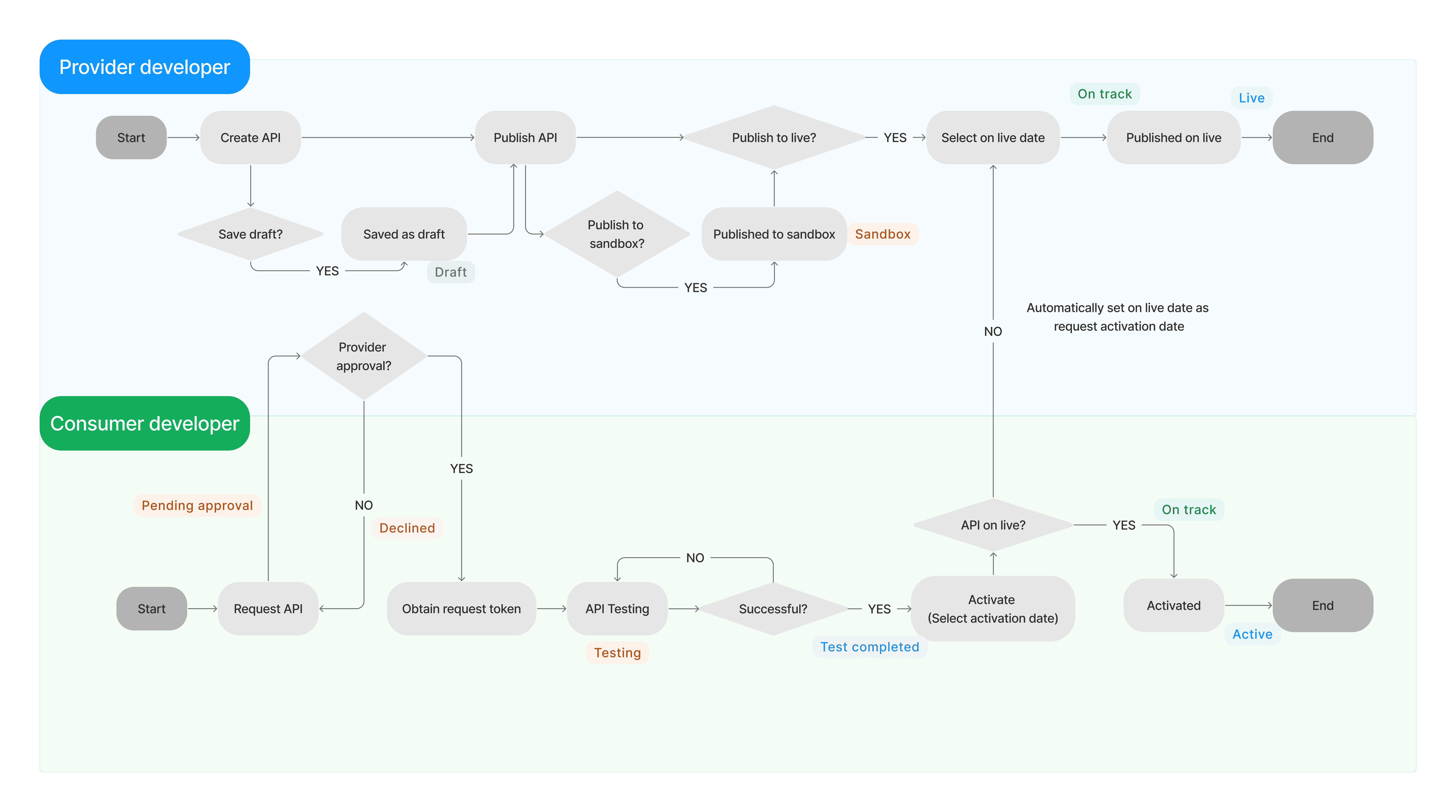
To tackle the absence of transaction status, I mapped out the process of API life cycle for both user roles and assigned mutually exclusive status to each phase that signifies progression.

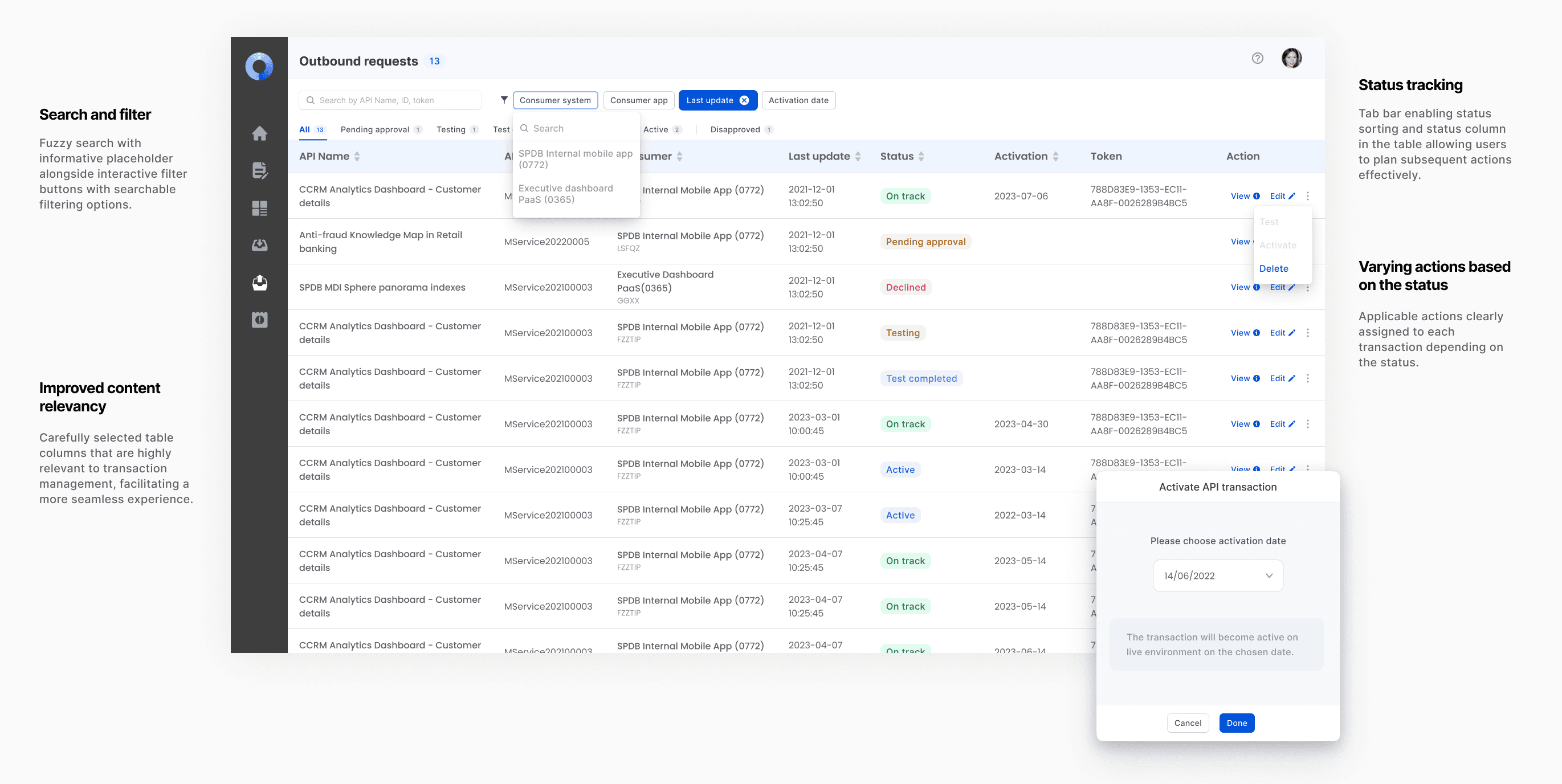
This was later incorporated on the pages displayed by the status column and tab bar enabling status sorting. The goal of the redesign was to offer users a comprehensive view to assist them in planning their subsequent actions.

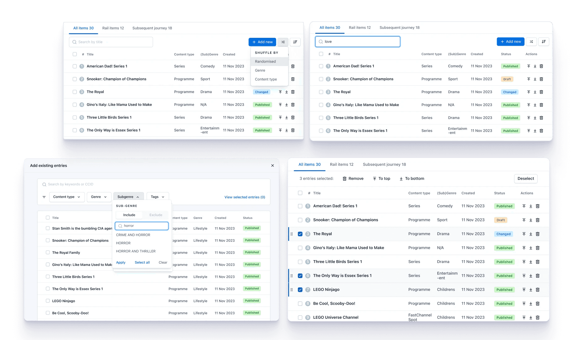
In addition to the status labelling, I've also introduced supplementary updates that seek to enhance the transaction management process illustrated below.

Achievement

25%+

Average reduction in transaction errors caused by management issues

“We used to have frequent issues with transaction tracking especially when there are version changes involved, this major update made it so much clearer. I'm happy to say that we've seen reduced transaction errors thanks to the changes.”

— Consumer developer testimonial

Phase 3

Build Product Community

Phase 3

Build Product Community

Phase 3

Build Product Community

Opportunities

In the last two phases, we focused on developer features. For this stage, our aim is to engage end users directly with our platform to increase our product's exposure. We consulted individuals in this role to understand their aspirations and reasons for using our product.

In the last two phases, we focused on developer features. For this stage, our aim is to engage end users directly with our platform to increase our product's exposure. We consulted individuals in this role to understand their aspirations and reasons for using our product.

In the last two phases, we focused on developer features. For this stage, our aim is to engage end users directly with our platform to increase our product's exposure. We consulted individuals in this role to understand their aspirations and reasons for using our product.

  • Discover work-related products: End users have a keen interest in finding data apis that could help with their line of work.

  • Understand outcomes & impacts: End users want to understand outcomes & impacts of api products without taking up excessive time.

Design solution

Sector categorization

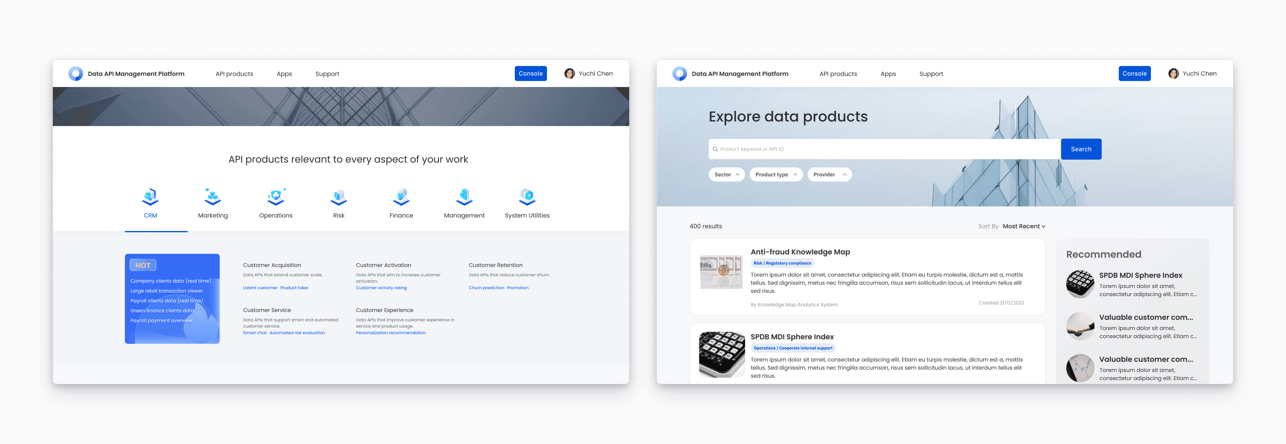
The first action I took was to incorporate unified sector categorisation applicable to data assets (maintained by the data governance team) to help users find api products highly relevant to their field. Upon confirming the applicability and practicality of the classification, I contacted our current API providers to update their respective category values. This data was gathered prior to our next product launch to ensure sufficient presentation.

Search & filter

This simple and straightforward functionality allows users to rapidly explore products.

Progressive informativeness: From key snippets to comprehensive details

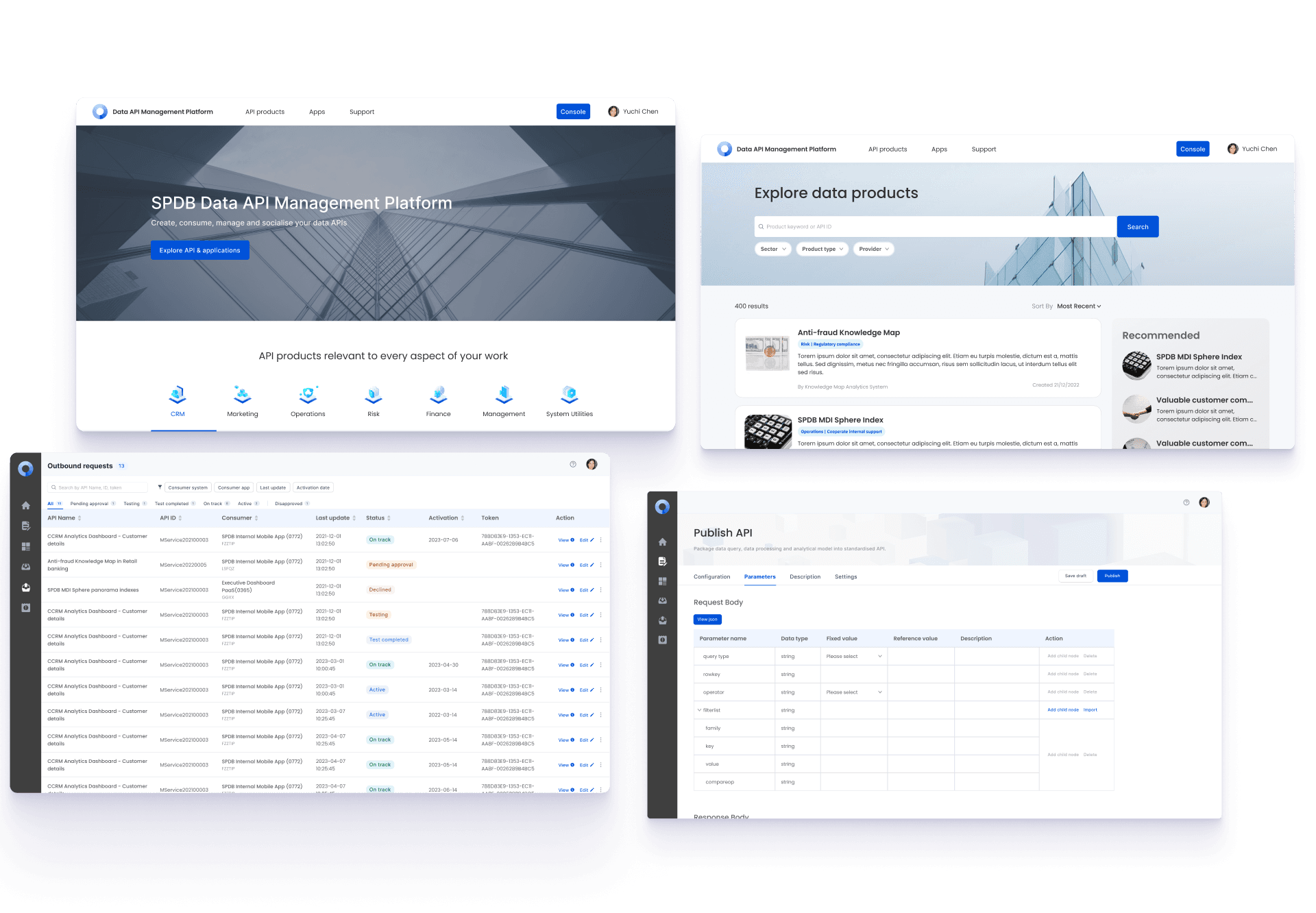
The redesign offered users a smoother content exploration journey – from the landing page for an introductory overview, to the search page for exploratory discovery, and finally reach the detail page for deeper examination. All the information displayed has been meticulously selected to guarantee thoroughness without overwhelming our users.

Achievement

Following this phase, our product team carried out extensive campaigns across the company, as it was believed the product had attained a level capable of supporting broad corporate use.

33%+

Growth in active data consumers

“As a branch manager, I want my teams to benefit from data analytics. The data API management platform provides such an open community that allows us to access data with minimum effort.”

— Regional branch leader testimonial

Reflection

What else could be done?

Reflection

What else could be done?

Reflection

What else could be done?

  • Design system

Prior to the redesign, the product team had planned to deploy elementUI (a desktop component library for VUE) as it is believed to save development time. However due to an increasing number of customised components, it would serve improved efficiency in design and product development to standardise and maintain our unique design system.

  • Auto-completion for api publishing

One of the solutions to improve publish efficiency was pull certain information automatically and spare our users from manual entry. However due to time constraints and the required cross team communications, we did not proceed with this feature,

  • Project planning

Some of the designs involved significant changes in the backend data and frontend layout, we decided to delay launching certain features in case we run out of time as a contingency plan. Looking back, I would involve developers as soon as possible so they could start working on backend data architect before the final design is finished.

Next phase

Going forward

Next phase

Going forward

Next phase

Going forward

The redesign equipped our product with essential features that will guarantee a smooth and satisfying user experience for all user roles, which pushed our product to a fast growth phase. The subsequent objective was to elevate our product into the next stage of development – the mature phase. We then concentrated on crafting supplementary functions to broaden the product's potential, including error tracing, API version management, performance analytics and API bundling.