Mosaic Design System
ITV • 2024
Project Summary
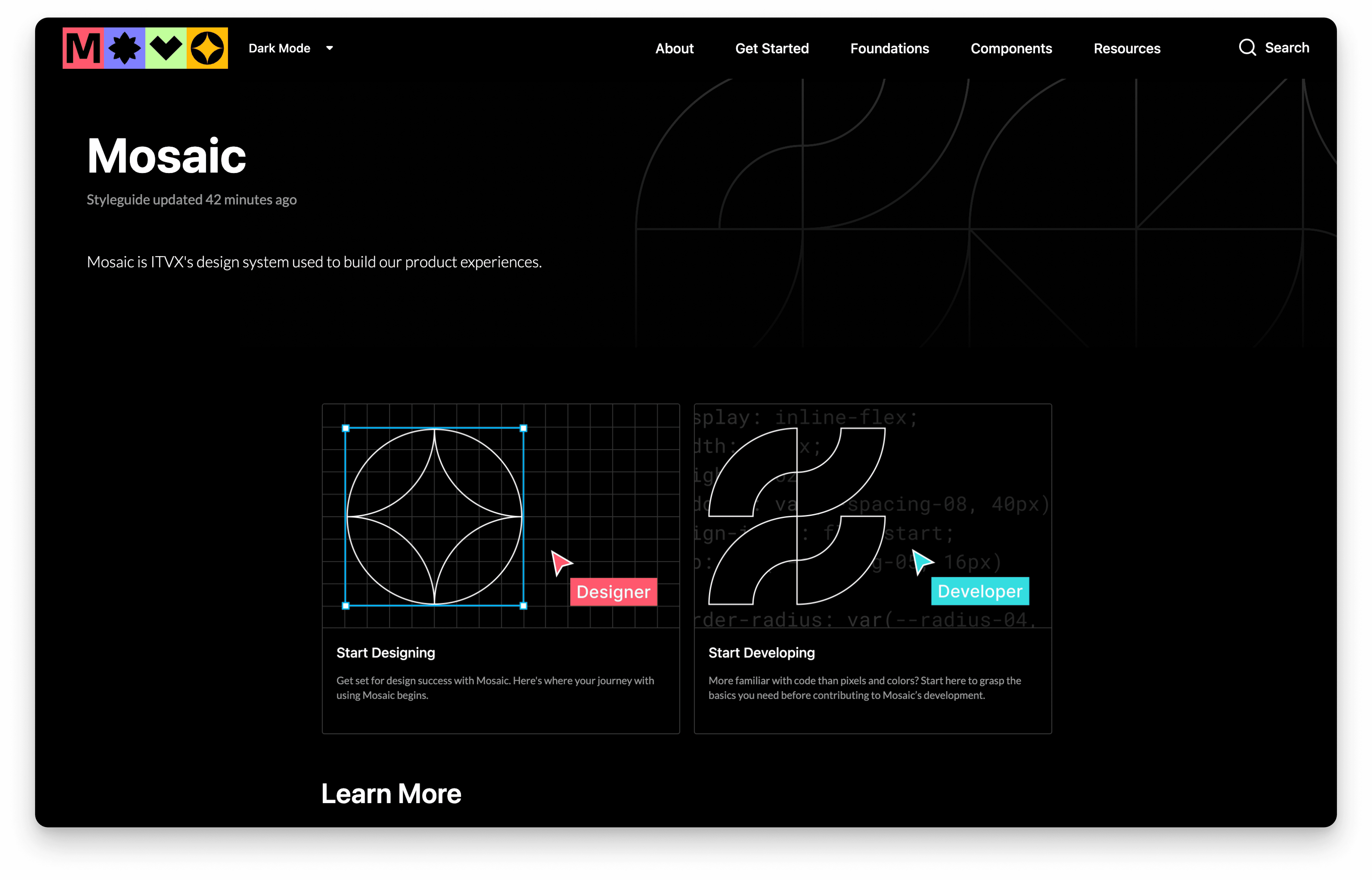
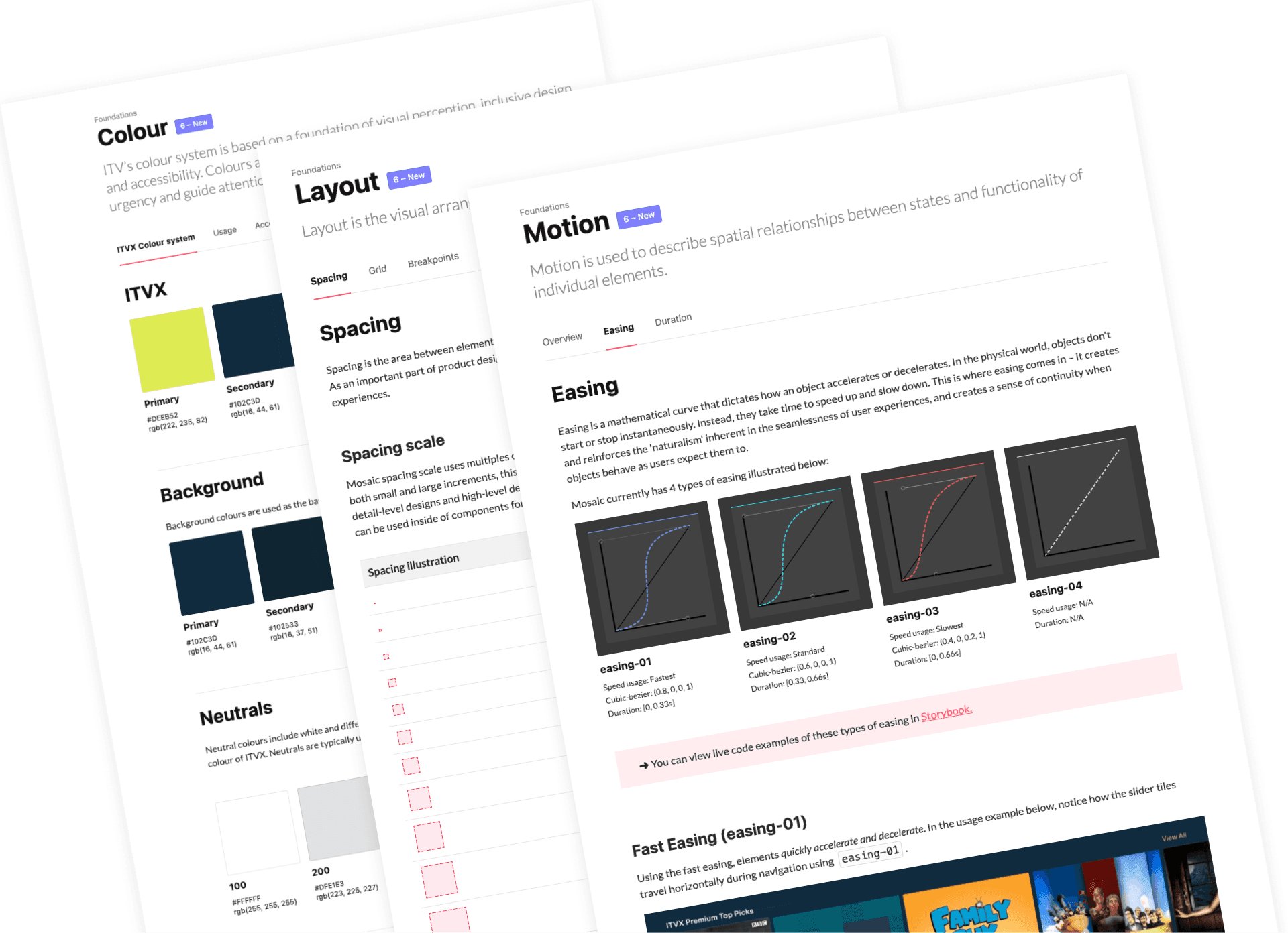
As ITV's design system evolves, it raised the urgent need of building a single source of truth for the design system. I orchestrated the blueprint of the centralized hub in three phases, solutions include robust and navigable information architecture, standardized and reusable component documentation templates accommodating over 300 components across 6 platforms.
What I did
Competitor Analysis
Testing
Information Architecture
Content Design
Documentation
Team
Head of design system
Senior product designer
Senior UX designer
Product designer
UI designer
PROBLEM
Urgent need of a single source of truth
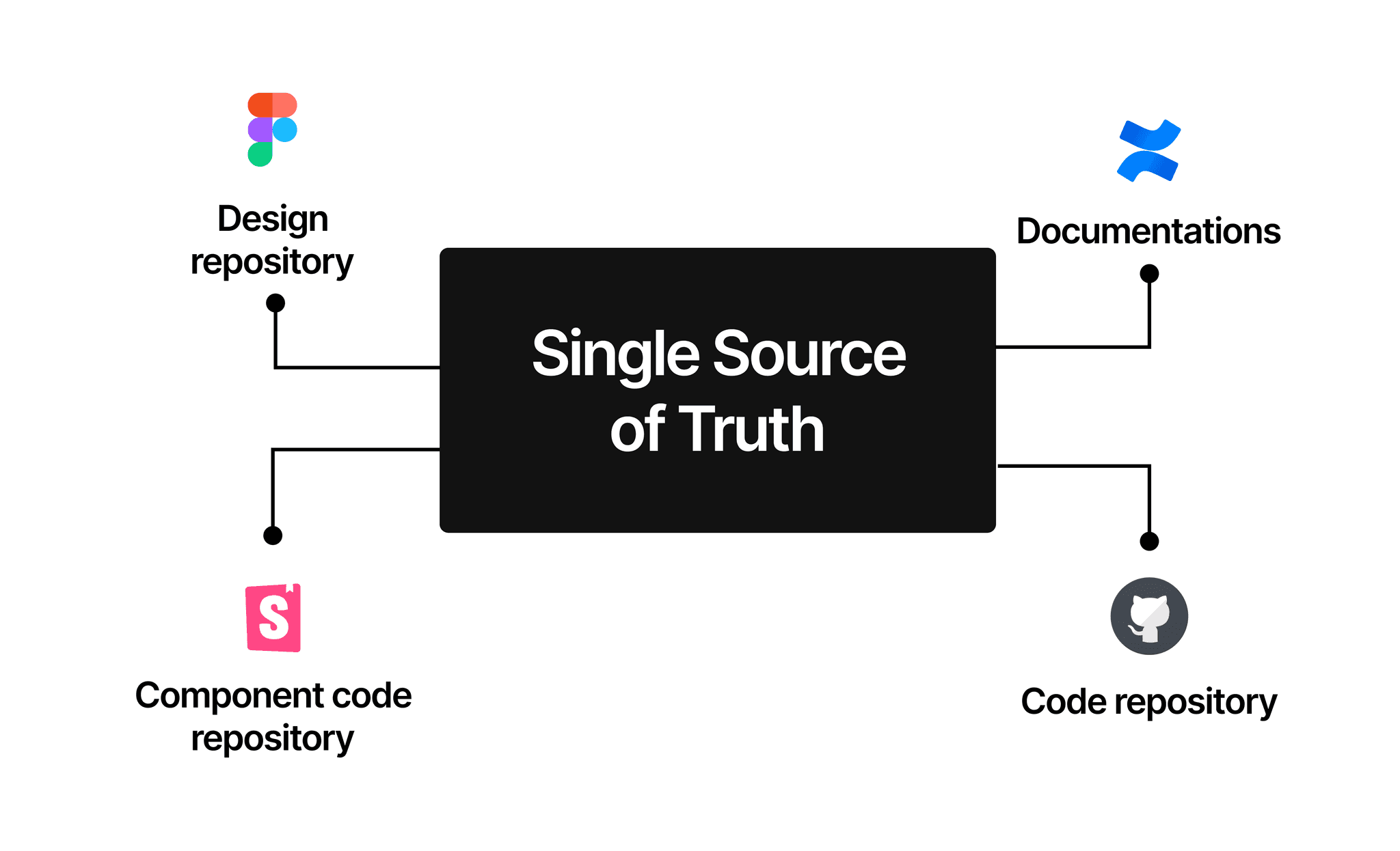
As ITV's design system evolves and expands, it became evident that users struggled to navigate the design system as resources are stored and documented in separate places. It raised the pressing need of building a single source of truth to bring together all aspects of the design system, and connect both direct and indirect users closer with the design system.
PHASE 1
Construct Hub Information Architecture
An effective documentation IA will enable users to locate information efficiently and confidently. Although there are many well established design system hubs out there for reference, it's crucial to understand real user problems, as well as finding a balance between existing and missing resources for efficient implementation.
Competitor analysis
I analyzed segments of documentations of well-established design systems and dot-down key learnings alongside screenshots. I also identified existing & missing resource elements against each segment to scope the content and to aid further tasking.
User research
I went through prior user research and distilled key insights relevant at this stage. Key considerations in IA include exposing user onboarding and contribution process, as well as filling gaps in current documentations.
SOLUTION
Recommended information architecture and content skeleton
I recommended an IA covering navigation structure, page skeleton and content design. The proposal was presented at team sessions and amended according to feedback. The IA aimed to expose user onboarding and contribution process. It also incorporated missing documentation including visual foundations, design tokens and resources.
PHASE 2
Architect Component Documentation
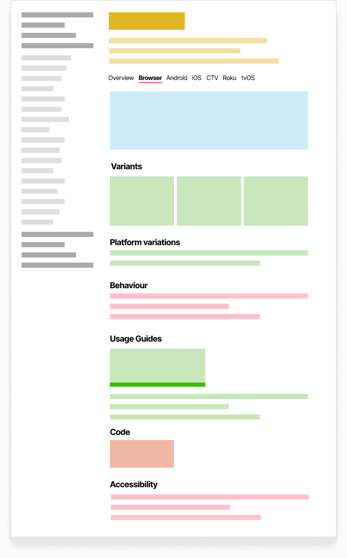
Finding a unified documentation template to accommodate over 300 components is challenging due to ITVX's cross-platform nature. With this in mind, each team member experimented a distinct documentation structure on real components. Below shows simplified illustrations of page structure exploration.
Tabs by platform
In this page structure, components are documented separately by platform
Details all platform variations.
Creates significant content duplications, causing inconveniences in both documenting and maintenance.
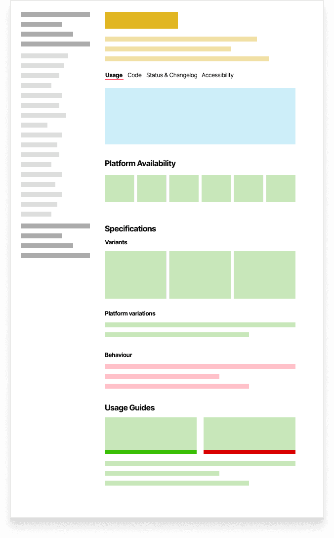
Tabs by content elements
This documentation structure group contents of by logical themes under tabs.
Easy navigation by logic content themes.
Cannot accommodate component containing different behavioral types or platform variations.
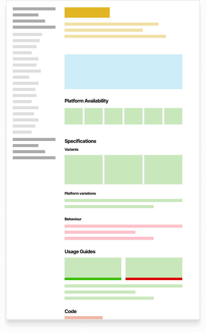
One pager
One pager aggregates all contents in one page without a tab navigation.
Suitable for simple components.
Tends to create lengthy documentation and difficult to navigate.
Opportunities
Exploration insights indicated that one component template might not be sufficient. It uncovered two core challenges we needed to solve:
HMW manifest platform variations without unnecessary duplications?
HMW accommodate component containing different types?
SOLUTION
Two unified templates accommodating various components
Based on exploration insights, I constructed two component documentation templates that accommodate a various of component types.
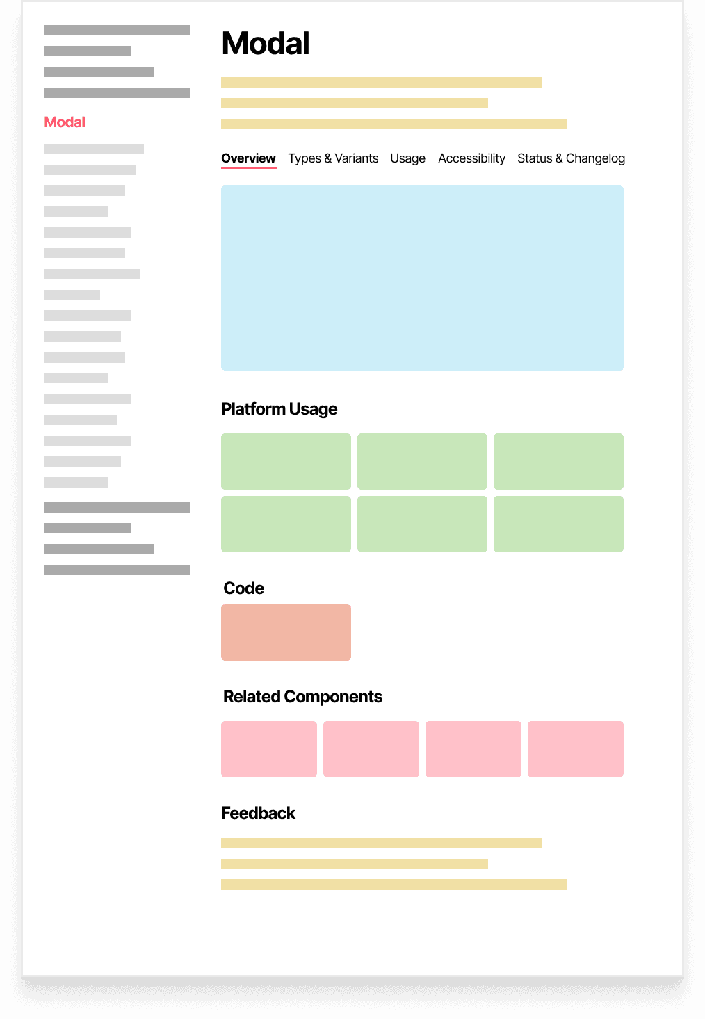
Simple Component Template
Suitable for component with one type of behavior, such as tooltip, modal and progress bar.
Single page
The template distilled an overview tab aiming to link relevant resources and call out platform usage and variations. The tabs are split by logic categories, allowing sufficient space and lower levels of IA under each category.
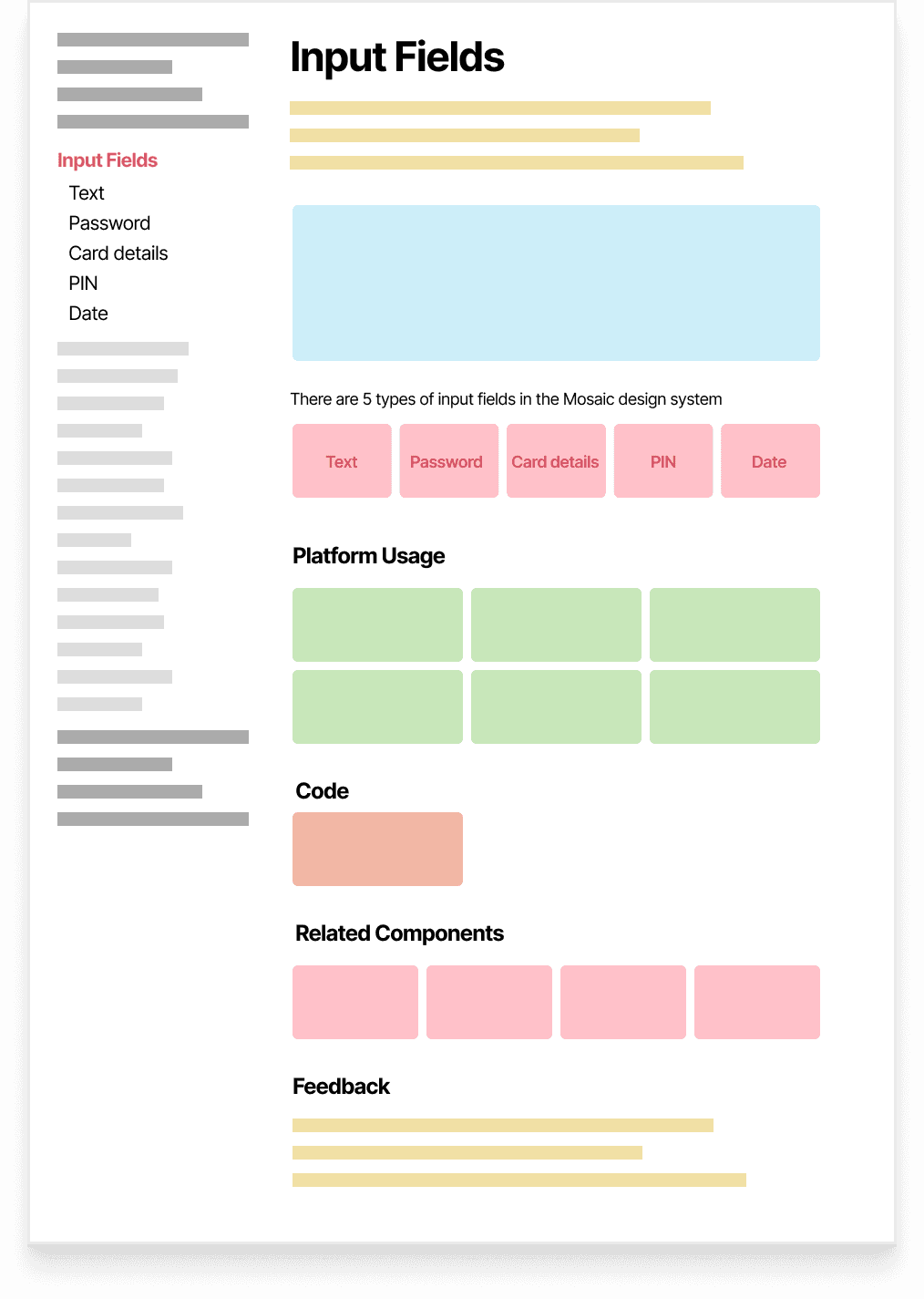
Complex Component Template
Suitable for component that contains multiple behavioral types. Such as, an inputs component group contains text input, password input, PIN input, card input and date input.
Component group overview
Navigation is split by component types. The overview page for the component group serves the same purpose as that of the simple component template, summarizing shared information across all component types.
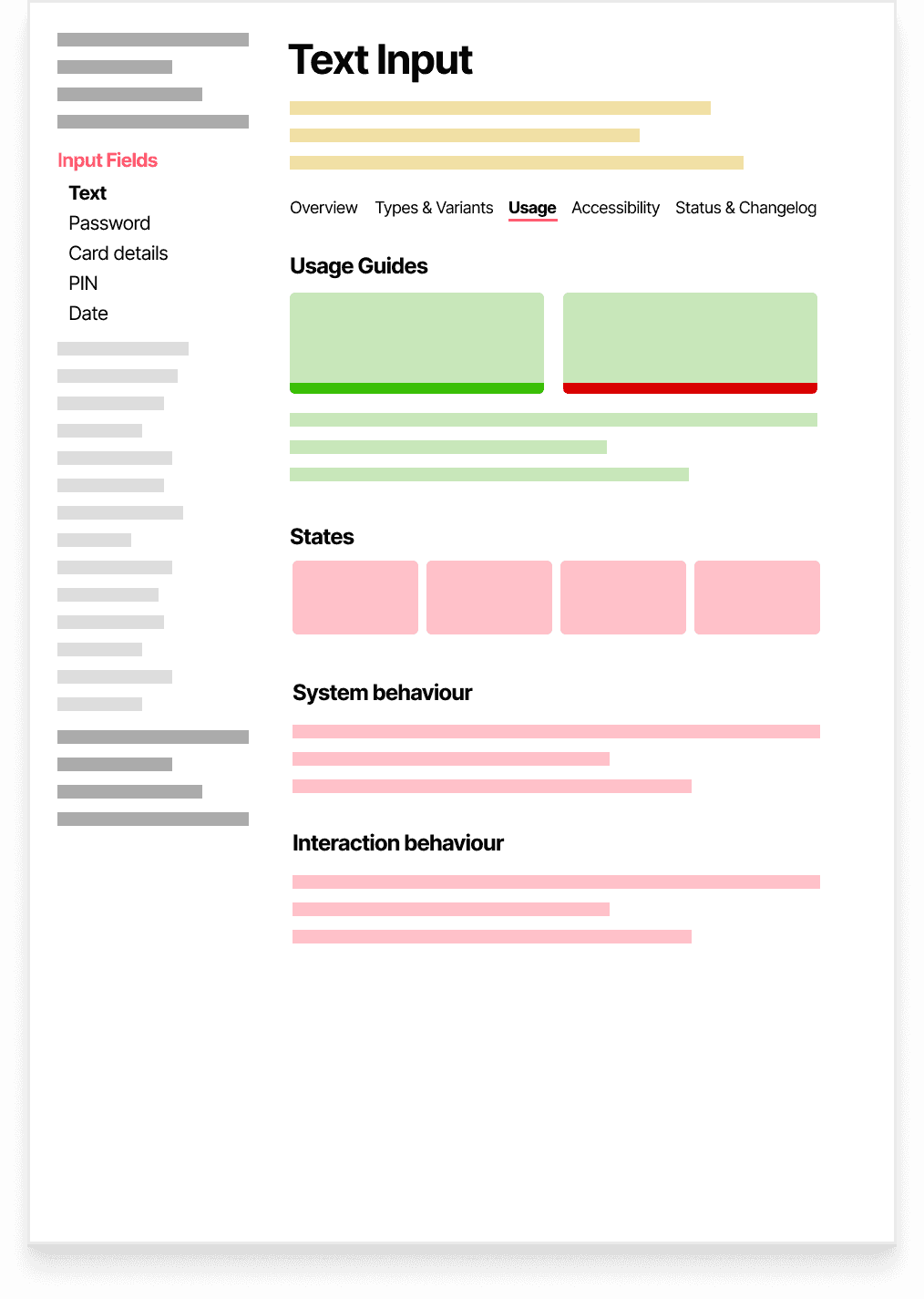
Component type page
Each component type within the component group has an individual documentation page, the tab structure of which remains the same as that of the simple component documentation.
A robust information architecture and content design was concluded for each template. This was demonstrated at team critique session and progressing with the templates was mutually agreed.
PHASE 3
Standardize Information Display
Standardizing information display is crucial to building consistent and robust documentation. The current documentation failed to foster code and design understanding due to a lack of logical clarity and distillation in information delivery. Thus there was a clear lack of trust towards documentations across dev and design.
Variant categorization
A component may have multiple properties, which can create multiplying amount of variants. This leads to redundancy and maintenance issues. HMW reduce redundancy in documenting component variants?
Component behaviour
Component behavior was currently documented in an unstandardized way, which developers find unreliable to understand and trust. HMW document component behavior in a manner that facilitate code understanding?
IMPLEMENTATION
Use Case Highlights
Platform variation call-out
Component variations across platforms is called out in a short sentence, leading users to figma library for detailed specs.
Standardized component behaviour description
Component behaviour is documented using "if…then" statements or in the form of user acceptance criteria (given…when…then). This improves logical clarity and foster better dev understanding.
Lean variant breakdown
For components containing multiple properties, variants are broken down by each property and its according values. This method avoids displaying large amount of variants as a result of multiplying properties.
Usage guidelines
Component usage was clearly defined and scoped as a part of template content guidelines. Common practices for this include usage rules (do's and don'ts), imagery and description.
RESULTS
Positive User Feedback
Director of Product Design
I couldn't be more proud of the team. A big milestone indeed! Well done to everyone.
Creative Product Design Lead
Amazing to see ITVX Mosaic Design System go to the next level and beyond. We started creating this over 5 years go as just a simple design component library in sketch and it's gone from strength to strength and now drives ITVX in both design and development to create quick consistent, accessible and connected features for all our great customers across the UK. A massive well done to our design system team and can't wait to see what's next.
Senior Product Designer
Great work by the internal ITVX Design System team. Crazy to think 5 years ago we started with a small tile component that has spawned a whole design system.

